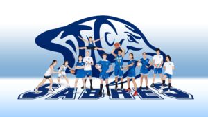
Sha Tin College SABRES logo Designer – alumna Abigail Yau
“I have always had a knack for art,” Abigail Yau, an STC alumna, tells us about her journey and the inspiration behind designing the STC SABRES logo. During our interview we learned all about her design process and how she came up with the striking logo that represents our school competitive sports teams.
From the blazing color to the immaculate detail of the logo, Abigail was mainly inspired by her favourite band, Arctic Monkeys, specifically the band’s album Humbug. She noticed that the band’s name was laid out “like a giant cat,” which inspired the idea for the side-profile of a sabre-toothed tiger’s head. Made out of “bold and streamlined line work,” Abigail encapsulates the animal’s personality of “power and drive.” In addition to this, the emphasis on the tiger’s dominant teeth is the highlight of the logo, making it instantly recognisable. Ultimately, these characteristics define the STC SABRES’s ethos of effort and dedication. She hopes that the ravishing tiger can excite the same inspiration for others.
To kick-off her design, Abigail compiled reference photos of the sabre-toothed tiger, specifically the tiger’s head instead of the whole body. Leading the design swiftly, she sketched out a few ideas to bring her vision to life. The side-profile was favoured, allowing creative room for the subtle reference to Sha Tin College. The subtle but sharp reference to the ‘STC’ initials as the stripes of the tiger wrapped up the logo.
During her time at STC, Abigail was a member of the Griffin House student leadership team. Her artistic skills flourished back then as she designed and customised t-shirts and varsity jackets to fit each member of the team. Her team spirit was also conveyed through her enthusiasm for Sports Day and Swimming Gala, reminiscing that these were events that “everybody participated in, as a showcase of school spirit”. She enthusiastically detailed her experience during these events, sharing that she had great fun cheering for her House in the stands as it made her feel “one with her house”.
When asked about how the experience of designing the logo influenced her later art projects, she responded that the experience caused her to “focus on the shapes and lines in her work”. She does so by placing her focus on abstraction and purpose, while simultaneously exploring the role of lines, shapes and movement in expressing emotions. Moreover, she emphasises the importance of conveying emotion and creativity as shown through her study of Media and Communication at the University of Leicester. She exclaimed, “this allows me to fully express my creative abilities and covers all my interests under one roof, including writing in the form of journalism and media in the form of film.”
Lastly, she credits her achievements and growth in art and academics to the support from STC and ESF. In particular, the teachers encouraged her to try her best by always having her best interests at heart and providing a warm and inclusive learning environment.
All in all, Abigail created an astounding logo for our STC SABRES that perfectly encapsulates our school’s team spirit. When asked for any wise words of advice, she shares that “creating is the purest form of self-expression” and urges us to let our “imaginations run wild and follow the flow.”
Written by Stefanie Leung (11X2) and Jia Yun Yue (11X2)
Edited by Christie Lam (12P2), Nicole Wong (12X2), Sylvia Chan (13G2)